Claude Design Landing Page Tutorial: The 12-Minute Build
A timed Claude Design landing page tutorial. Walko, prompt to public URL, 12 minutes flat. Includes the 10-line prompt template that kills generic output.
>This is the first BUILD STEP of the book. Claude Design Playbook ships 8 projects on top of this one and prices the work at $500 to $5,000.
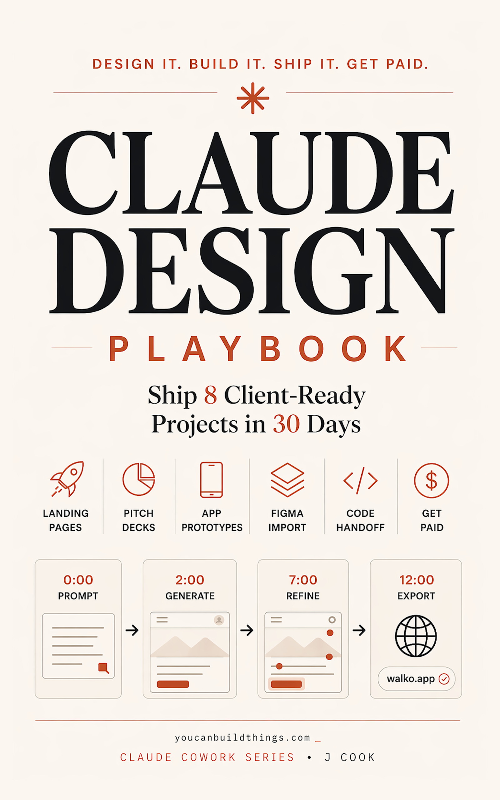
Claude Design Playbook
Ship 8 Client-Ready Projects in 30 Days
Summary:
- Write the prompt as a one-shot brief with 10 specific fields, not a chat message.
- First generation lands at 70-80%. Refine with 3 inline + 1 chat + 1 slider, not 11 chat messages.
- Export as standalone HTML. Drag onto Netlify Drop. Public URL in 30 seconds.
- First time: 25 minutes. Fourth time: 12 minutes flat.
Looking for a Claude Design landing page tutorial that doesn’t end with you refining a teal-gradient SaaS dashboard for forty minutes? The fix is treating the prompt as a one-shot brief, not a chat. Do that and you’ll ship a public URL in 12 minutes flat.
The chapter image below is the actual sequence I run, timed to the minute. Same pattern works for SaaS waitlists, B2B demos, creator offers, local services, and pre-launch pages.
What should the Claude Design landing page prompt look like?
A one-shot brief with 10 fields, not a chat message. Open a second tab. Notion, Apple Notes, anywhere. Write the brief there first, paste it into Claude Design last. The Anthropic Help Center confirms the workflow at support.claude.com: “Get started with Claude Design” lists Set up your design system in Claude Design and the export options as “HTML bundles, PPTX, PDF, and hand-off to Claude Code.” The prompt is your input. The export is your output. Refinement is the middle 5 minutes.
Here is the template I run on every client landing page:
PRODUCT: [Name]
ONE-LINE DESCRIPTION: [What it does, plain language, one sentence]
TARGET USER: [Specific enough that you can picture one person]
PRIMARY ACTION: [Sign up / book a demo / join waitlist]
KEY MESSAGE: [The one thing the page must get across]
TONE: [Three adjectives describing the brand voice]
SECTIONS NEEDED: [Hero / features / testimonials / pricing / FAQ / footer]
VISUAL REFERENCES: [1-3 sites or styles this should feel like]
COLORS TO AVOID: [Teal, generic blue. Kill the default SaaS palette]
MUST INCLUDE: [Specific copy, stats, or proof points]
Ten lines. Each one kills a refinement round you’d otherwise spend five minutes on.
What did the Walko brief look like?
Maya is the running example: a non-technical solopreneur with a dog-walker marketplace and 23 paying users in Brooklyn. Her brief, filled in:
PRODUCT: Walko
ONE-LINE DESCRIPTION: Marketplace matching urban dog owners with nearby walkers for 1 PM pickups during the workday.
TARGET USER: 32-year-old remote worker with a rescue dog and a Tuesday-Thursday in-office schedule.
PRIMARY ACTION: Join the Sunday launch waitlist with email.
KEY MESSAGE: Your dog gets a 45-minute walk at 1 PM without you rearranging your meeting calendar.
TONE: Warm, practical, slightly playful.
SECTIONS NEEDED: Hero with waitlist form, three-column "How it works," testimonial strip, "Walker earnings" stat block, FAQ (4 questions), footer.
VISUAL REFERENCES: The Farmers Dog, Honey's Real Dog Food, old Warby Parker before the 2022 redesign.
COLORS TO AVOID: Teal, electric blue, and anything that says "fintech."
MUST INCLUDE: "Starting in Brooklyn. Expanding to Manhattan this summer." Stat: "Walkers earn $28 average per hour."
Notice the COLORS TO AVOID line. That single line kills the teal-gradient default the Reddit thread won’t stop complaining about. You cannot avoid a default you never named.
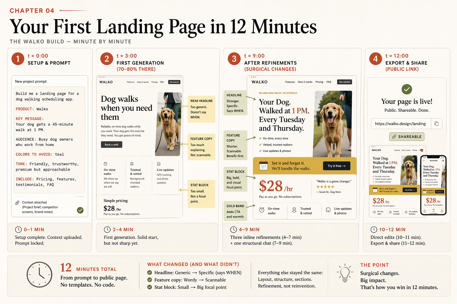
What does the build look like, minute by minute?
t + 0          Open claude.ai/design. New project "Walko launch page."
               Paste the brief. No uploads yet (brand kit comes in chapter 5).
               Submit.

t + 3 min      First generation lands. Hero, three feature cards, testimonial
               strip, earnings stat block, FAQ, footer. The copy is V0 weak:
               "Dog walks when you need them. / Reliable. Trusted. Fast."
               It's 70-80% of the way there. Read everything. Don't touch.

t + 9 min      Three inline comments + one slider drag.
               Inline 01 on the hero: "Rewrite to emphasize the 1 PM midday
                 window. Aim for 'Your Dog. Walked at 1 PM. Every Tuesday and
                 Thursday.'"
               Inline 02 on feature cards: "Each headline becomes an action,
                 not an adjective. 'Tell us your dog's schedule', 'Match with
                 a walker', 'Track every walk on the map'."
               Inline 03 on stat block: "Make the $28/hour number the focal
                 point. Currently buried."
               Slider: "Give me a slider for 'playful vs polished' on the
                 typography." Drag to ~65% playful. Commit.
               One chat refinement: "Add a 'Try it free for your first walk'
                 band between features and testimonials. Gold-ish color.
                 Secondary button to the waitlist form."

t + 11 min     Two direct edits to fix typos. Update stat to "Walkers earn
               $28 average per hour." Press Escape.

t + 12 min     Export → Standalone HTML → .zip. Drag the extracted folder
               onto app.netlify.com/drop. Public URL in 30 seconds.
               Send to a friend.
That’s the entire build. 1 prompt + 3 inline comments + 1 chat refinement + 1 slider + 1 export. Six moves. Twelve minutes.
The first time you do this it’ll take 25. The fourth time, 12. The variable is upfront thinking, not generation speed.
Why does the first generation look weak?
Because it’s not the final. It’s the structural map. Read every word. Click every button. Don’t react yet. The first version of Walko’s hero said Dog walks when you need them. and the feature cards said Reliable. Trusted. Fast. That’s the V0 weak copy you’ll see most of the time. Claude leans on adjective filler when the prompt doesn’t give it specific stories or numbers to lean on instead.
Refinement is the part that makes V0 into V3. Here’s the inline-comment template that turns generic into specific, every time. Click the headline in the canvas. Leave this comment:
# inline-comment-template.txt. paste into the canvas comment box

Rewrite to emphasize the [SPECIFIC ANGLE].
Aim for something concrete with a noun and a time, not an adjective.
Format suggestion: "[noun]. [verb]. [specific moment]."
What [SPECIFIC ANGLE] looks like in practice:
| Vague comment (produces randomness) | Specific comment (produces a fix) |
|---|---|
| “make the headline more punchy" | "rewrite to emphasize the midday window" |
| "make it warmer" | "rewrite to emphasize that the walker is a neighbor, not a stranger" |
| "less corporate" | "rewrite to emphasize that the price is transparent and per-walk, not a subscription” |
The format rewrite to emphasize [specific angle] is the workhorse. Specific input produces specific output. Vague input produces randomness. Walko’s V0 (Dog walks when you need them) became V3 (Your Dog. Walked at 1 PM. Every Tuesday and Thursday.) on a single inline comment of this shape.
What do you do when the first generation is structurally wrong?
Restart. Don’t refine.
If you asked for three feature cards and got an icon list, if you asked for a testimonial strip and got a single quote centered, if you asked for an FAQ and got a contact form, the bones are wrong. Refining a structurally-wrong design into the right structure costs 15-25% of your weekly allowance. Restarting from a sharper prompt costs roughly 2%.
# restart-protocol.txt

1. Scroll up to your original prompt
2. Copy it
3. Same project: open the three-dot menu next to the project name
4. Click "New canvas" (or start a new project on plans without multi-canvas)
5. Paste the prompt and add ONE explicit ordering line:
   "Specifically, I need this section order: hero, three-column feature
    cards, testimonial strip, stat block, FAQ, footer."
6. Submit. The explicit ordering gives Claude a stronger structural lock.
By rule of thumb, if you’re four refinements in and the structure still isn’t right, restart. The cost math always favors starting fresh.
How do you ship the page to a public URL?
Three options, ranked by friction:
| Platform | Setup | Friction | Best for |
|---|---|---|---|
| Netlify Drop | None (drag and drop) | Lowest. 30 seconds, no account | Hello-world, friend feedback |
| Cloudflare Pages | Free account + CLI | Low. Best for traffic spikes | Product Hunt launches |
| Vercel | Free account + CLI | Low. Best Next.js integration | Most production landing pages |
For a first build, drag the extracted .zip onto app.netlify.com/drop. Done. The URL is the same place you dropped the folder. Open it in incognito. Send it to three people for the five-second test.
If you skip the public URL step, you’ll never know whether the page works. The screenshot in your laptop browser is not the test. Strangers opening it on their phones is the test.
What should you actually do?
- If this is your first project → use Walko or your own product. Pick one. Don’t switch examples between sections of the brief. Consistent details produce consistent output.
- If your prompt is over 200 words → it’s probably right. The brief format is verbose by design. Specificity is what kills generic output.
- If your first generation is structurally wrong → restart with explicit section ordering, don’t refine.
- If your first generation has the right structure but weak copy → use
rewrite to emphasize [specific angle]inline comments, not “make it better” chat messages. - If you’re over 12 minutes on your first build → that’s expected. Time-box the project at 25 minutes. After three projects you’ll be at 15. After ten, 12.
bottom_line
- The prompt is a brief. Treat it like one. Ten lines, all filled.
- The first generation is the map, not the destination. Refine surgically.
- Public URL or it didn’t ship. Stranger feedback is the test.
Frequently Asked Questions
How long does it actually take to build a landing page in Claude Design?+
Twelve minutes by your fourth project. Twenty to twenty-five your first time. The variable is upfront thinking, not generation speed. The first generation comes back in 60-90 seconds; refinement is 5-7 minutes; export and deploy is 2-3 minutes. Tightening the prompt is what compresses the total.
What do I put in the Claude Design landing page prompt?+
Ten fields: product name, one-line description, target user, primary action, key message, tone, sections needed, visual references, colors to avoid, must-include facts. Filling all ten upfront kills more refinement rounds than any other discipline. Skipping the 'colors to avoid' line is what produces the teal-gradient SaaS-dashboard look.
Where do I deploy the Claude Design HTML export?+
Drag the extracted folder onto app.netlify.com/drop for the fastest path: 30 seconds, no account needed. Cloudflare Pages and Vercel both work via CLI for production. For client work that needs a custom domain, Vercel auto-provisions SSL and the free tier handles a Product Hunt launch traffic load.