Claude Design Generic Output: The 5-Step Brand Kit Fix
Tired of Claude Design output that screams 'I just used one Claude prompt'? The 5-step brand kit setup that flips defaults to client-quality on-brand work.
>This is the brand-kit chapter cut short. Claude Design Playbook walks the full 8-project system from this kit to a $500-$5,000 service offer.
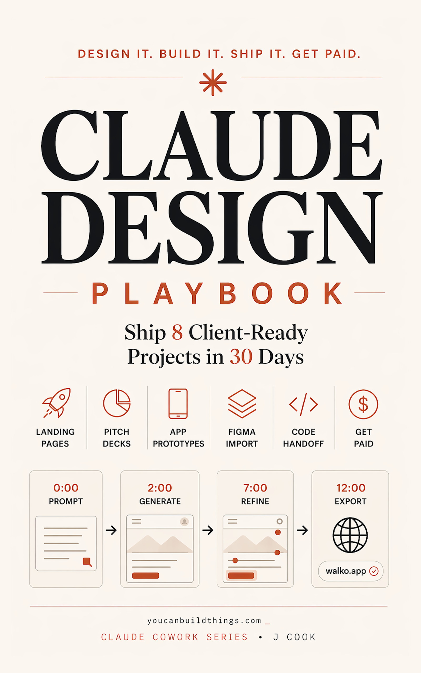
Claude Design Playbook
Ship 8 Client-Ready Projects in 30 Days
Summary:
- Stop fighting the prompt. Claude Design generic output is a system problem, not a wording problem.
- The fix is an org-scoped design system built from real source material in 60 minutes.
- Four specific changes flip the output: palette, type, photo, button.
- Reusable kit you re-apply on every future project for the same brand.
You opened Claude Design last week and got back a teal-gradient SaaS dashboard. You tried again with a tighter prompt. Same teal. You read the Reddit thread about why every Claude Design generic output looks the same and someone in there told you to upload a colors.json file. Save your time. That folder structure does not exist.
This is the actual fix, the one the 16-year designer in the launch thread was hinting at when they said the tool is “spectacular if you take the time to set up a design system.” A 60-minute setup, run once, attached to your Anthropic org, applied automatically to every future project. By the end of this article you have it running.
Why does my Claude Design output always look the same?
Because Claude Design applies its internal default style when nothing else is published, and that default is one of three or four presets the model has been running for months. From u/gav1no0 in the r/ClaudeAI “Claude Design is Incredible…” thread (91 upvotes):
“Yeah I guess claude design is just using claude frontend-design skill by default, which I used for 2-3 months now and its ALWAYS the same. Actually it has like 3-4 presets, techy, newspapers … but yeah, now I can’t use it because it screams ‘I just used one claude prompt’”
A different commenter in the same thread, u/disky_wude (500 upvotes): “It gave me similar fonts and style for a calendar style app. I guess now every new app for two months will have the same design.”
The fix is not a better prompt. Hear that. You can rewrite the prompt thirty times and Claude will keep snapping to the same teal-and-Inter default. The fix is to publish a design system to your org. Once it’s published, every new project the org generates inherits it. The default is replaced.
What broke before the fix
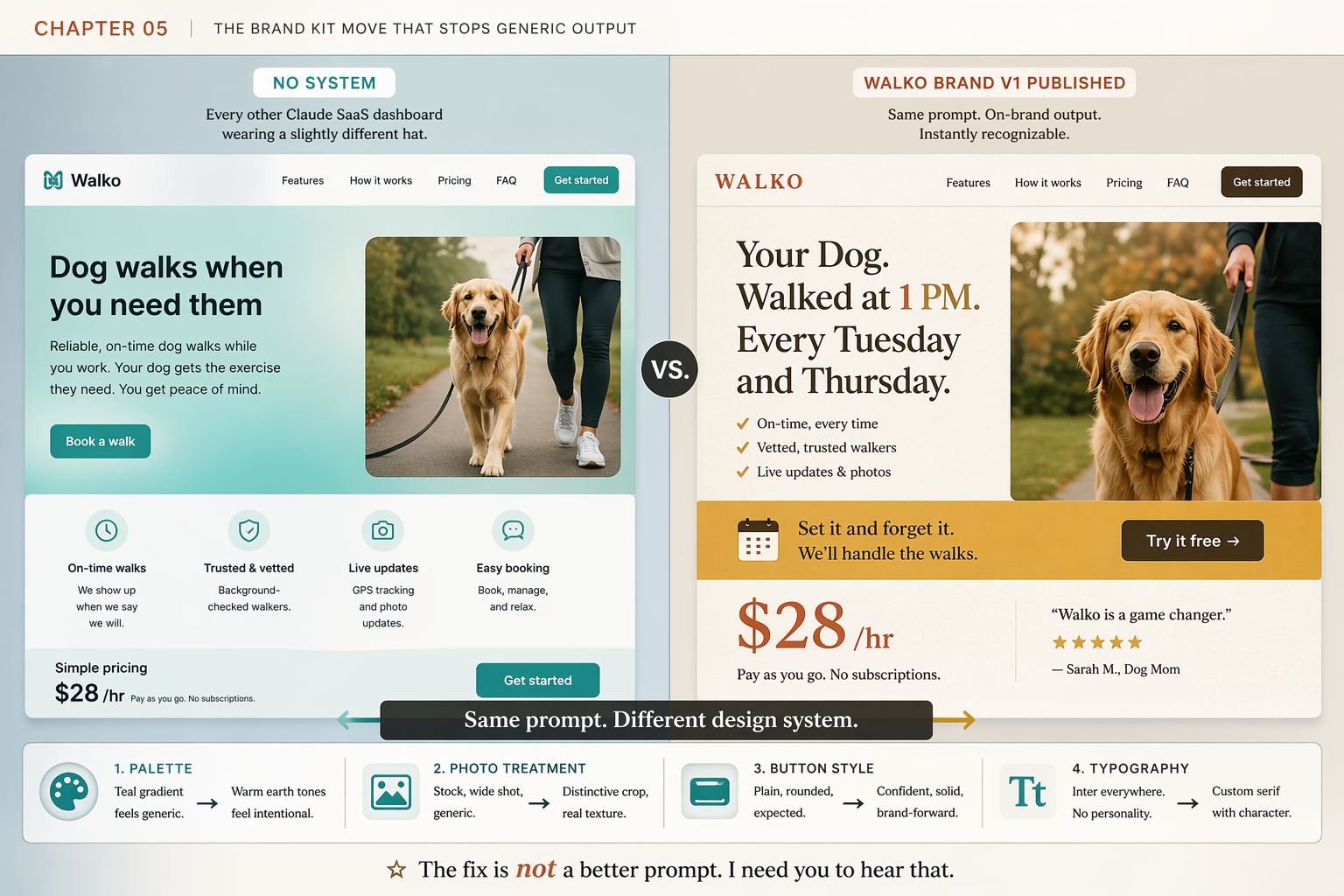
I burned three sessions on one Walko landing page before I got it. Same prompt every time. Different “be more warm and editorial” wording. Same generic output. Same stock retriever. Same Dog walks when you need them headline with On-time walks / Trusted & vetted / Live updates / Easy booking adjective bullets. Same teal hero.
The mistake was treating the prompt as the lever. The prompt is not the lever. The system is the lever. When I went into Claude.ai > my profile > Organization settings > Claude Design design systems and built one for Walko, the next prompt I ran returned a page with the warm-brown-and-gold palette, an italic serif accent, an outdoor dog photo with the owner, and the headline Your Dog. Walked at 1 PM. Every Tuesday and Thursday. Same prompt. Different design system. Four named changes:
- PALETTE: Teal SaaS default → Warm brown, gold accent
- TYPE: Inter 800 all-caps → Serif 500, italic accent
- PHOTO: Stock golden retriever → Rescue, owner’s stoop
- BUTTON:
rounded-lgTailwind → Italic chip, gold
Sixty minutes of setup work. Every future Walko project starts on-brand with no extra effort.
What is the actual brand-kit setup process?
The official Anthropic flow is five steps. Run each one. Skipping any of them is how you publish a half-formed system.
01 UPLOAD source material (logo, deck, brand book PDF, codebase link)
02 EXTRACT: Claude reads it and proposes a system
03 VALIDATE with three test prompts (hero / pricing / testimonial pages)
04 PUBLISH the system: toggle ON in org settings
05 REMIX over time as the brand drifts or the client rebrands
Notice what the Reddit myth got wrong. There is no colors.json. There is no typography.css. There is no canonical folder structure. Claude Design is a web product at claude.ai/design. It does not watch your local file system. It does not open folders on your laptop. The system lives in your Anthropic org. The myth came from people confusing Claude Design with Claude Code (the CLI), which does read specific config files like CLAUDE.md. Different products. Different rules.
How do you gather source material that actually extracts well?
Claude is pattern-matching during extraction. The more times a pattern appears in your inputs, the more confidently it picks the pattern up. Source material falls into four tiers, ranked by signal strength:
| Tier | What you upload | Extraction fidelity |
|---|---|---|
| Tier 1 | Live codebase or component library (link the GitHub repo) | Near-perfect |
| Tier 2 | Polished slide deck or brand-book PDF (15+ pages of brand applied) | High |
| Tier 3 | Brand-guideline assets (logo SVG, palette hex codes, typography spec) | Medium |
| Tier 4 | Individual assets (just a logo, just a color, just one photo) | Low. Defaults leak. |
If you only have tier-four material, do not start there. Spend an hour and build a 5-slide mini-deck in Google Slides. Slide 1 the logo. Slide 2 a moodboard of three reference images. Slide 3 the palette. Slide 4 the type pairing. Slide 5 a voice-and-tone paragraph. That single hour tiers your input from 4 to 2. Skip it and the extraction is thin.
What should the upload bundle look like?
For Walko, the bundle was five files: the SVG logo, a 6-slide mini-deck I built in Google Slides, three reference photos compressed to 1200px wide, one plaintext brief, and a competitor screenshot (Farmers Dog) labeled COMPETITOR-REFERENCE-farmers-dog-for-tone-only.png so the context was clear.
The plaintext brief is the move nobody documents. Drop a tight brand-notes.txt next to the visual files. It carries high priority during extraction because it’s small and specific:
WALKO BRAND V1: OVERRIDES

Primary green is the sage from the website, not the deck.
When sources conflict, trust the website.

Headings: Söhne, weight 600 (or substitute Inter at the same letterspacing).
Body: Inter, weight 400.
Sizes: H1 48px, H2 32px, H3 24px, body 16px.
Line height: 1.5 body, 1.2 headings.

Voice: warm not twee, practical not aspirational, local-feeling not national-feeling.

Buttons: solid primary, 8px radius, white text, 16px vertical padding.
Cards: 12px radius, 1px solid light gray border, 24px padding.

Photography: natural light, shallow depth of field, tight crop on the subject,
warm color grade. Never stock-photo perfect smiles.
Ten lines. Saves a Remix round.
How do you validate a design system before publishing?
Three test prompts. Run each one in a fresh project (not the same one you set up the system in) before you toggle Published ON. The exact prompts:
# the-3-validation-prompts.txt: paste each into a fresh project, one at a time

01  Create a landing page hero for Walko. Two sentences of copy max.
    One CTA button.

02  Design a pricing page with three tiers for Walko.

03  Create a testimonial page with four customer quotes for Walko.
For each generated output, score it against three checks:
| Check | Pass condition |
|---|---|
| Palette match | All major colors within ~5% of source hex values |
| Typography match | Heading + body fonts match the spec, sizes within scale |
| Component match | Buttons, cards, inputs use the system’s variants, not Claude’s defaults |
Three passes on all three prompts means publish. Any score of two or below means hit Remix on the system, fix the miss, then re-run the prompt that failed. The 10 minutes of validation saves an hour of rework on the next paid project.
How do you actually publish and reuse the system?
Inside Claude.ai > Organization settings > Claude Design design systems:
1. Click the system you just validated
2. Toggle "Published" → ON
3. Open a brand-new project (do not reuse the validation projects)
4. Run the same prompt you tried in the broken Chapter 1 attempt
5. Compare the output side-by-side with your old generic version
Every new project the org creates from this point inherits the system. Old projects do not retroactively inherit, so if you have a generic-looking Walko page from before, either start fresh with the same prompt or open the old project and explicitly ask Claude to “apply the Walko brand v1 design system to this page.” Option one is cleaner.
Naming matters. Call it Walko brand v1. When you make material changes later, create Walko brand v2 rather than overwriting v1. That way you can A/B-generate against both versions and keep an audit trail of what changed.
What should you actually do?
- If you only have a logo and a hex code → build the 5-slide mini-deck in Google Slides first, then upload that as your tier-2 input. One hour of prep saves a Remix round.
- If you have a working codebase → link the GitHub repo as source material. The extraction lands closest to production-real because the code is already production.
- If you skipped validation and the first paid project came back off-brand → don’t refine the project. Go back to the design system, Remix the misses, then re-render the project. Project-level fixes don’t propagate to the next client.
- If the client rebrands or refreshes their palette → rebuild as
v2and migrate the next project. Don’t drift the existing v1.
bottom_line
- Stop refining the prompt. Refine the system.
- Sixty minutes of setup is the difference between “screams I used one Claude prompt” and “looks like a real designer made it.”
- Ship the kit before the client work, not after. The kit is not optional infrastructure.
Frequently Asked Questions
Why does my Claude Design output always look the same?+
Because without a published design system, Claude applies its internal default. r/ClaudeAI users call it the 'one Claude prompt' look. The fix is the 5-step Anthropic process: upload source material, let Claude extract the system, validate with three test prompts, toggle Published ON, then refine with Remix.
Do I need a colors.json and typography.css folder for Claude Design?+
No. That folder structure is a Reddit myth. Claude Design is a web product at claude.ai/design and does not read your local file system or recognize any canonical filenames. The system lives in your Anthropic org settings, not on your laptop.
Can I set up a Claude Design brand kit without a real codebase or polished deck?+
Yes. If you only have a logo and a vague palette, build a 5-slide internal mini-deck in Google Slides showing your colors, typography, and one moodboard slide. That alone tiers your input from raw assets to a deck Claude can extract from cleanly.