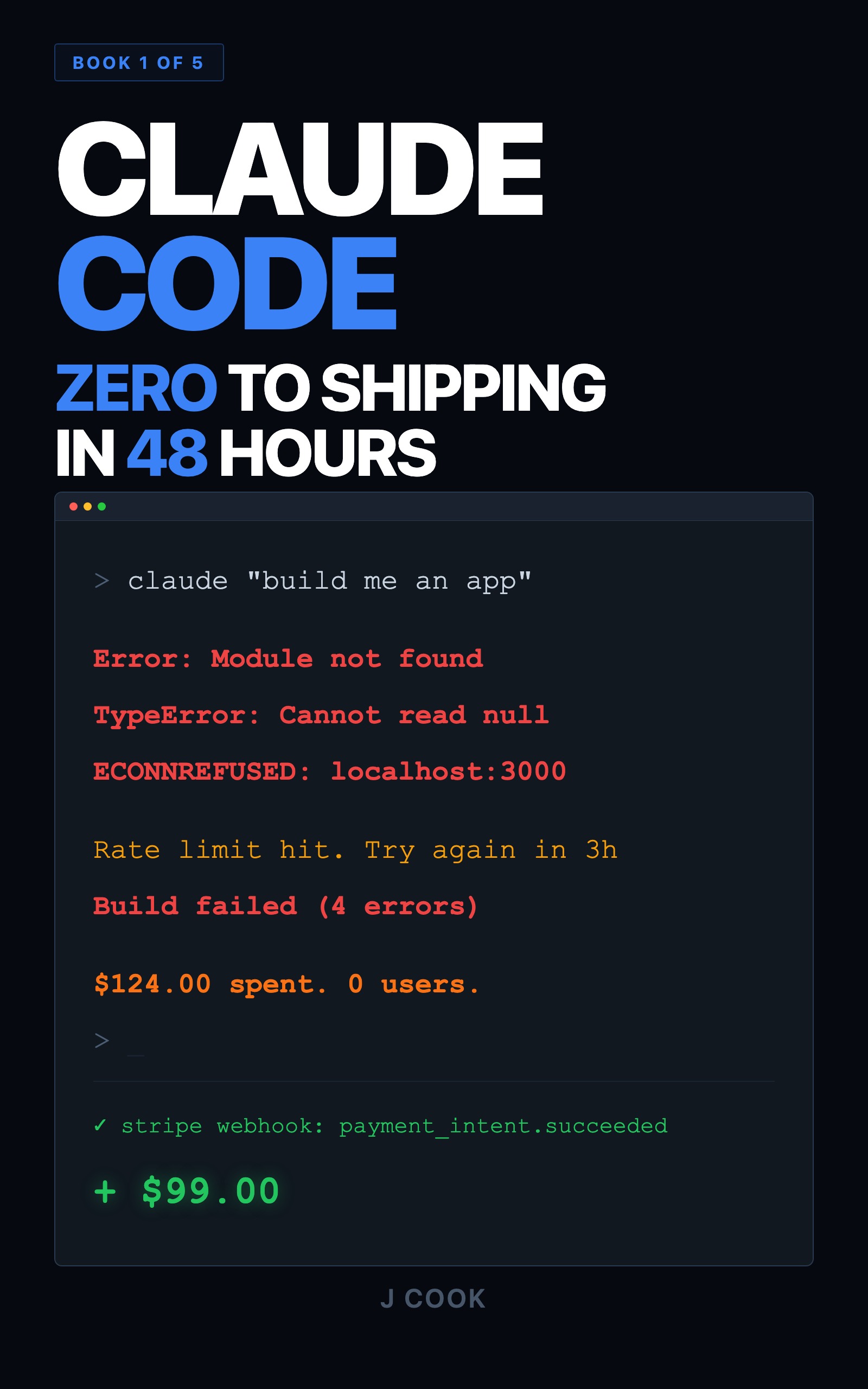
Fix Ugly UIs in Claude Code With the Screenshot Loop
Your Claude Code UI looks wrong but the code is fine? The screenshot loop fixes it in three quick rounds, because Claude has no eyes to see what you see.
>This is the screenshot loop in full. Claude Code for Beginners runs it on a real app, from empty folder to launched product.
Summary:
- Stop describing visual bugs in words. Screenshot the page and hand Claude the image.
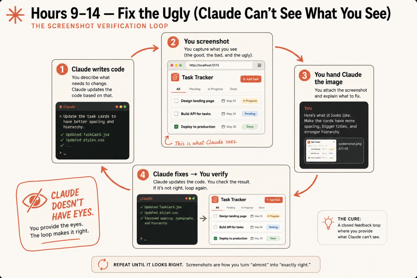
- Run the four-step loop: Claude writes code, you screenshot, you feed it the picture, Claude fixes, you verify.
- Add a design-system.md so Claude has rails, not guesses.
- Walk away with a design-review workflow for any page in any project.
A Claude Code ugly UI is not a prompting problem. It’s a feedback problem, and the root cause is simple: Claude doesn’t have eyes. Your app works, it just looks like a class project from 2014. You describe the fix, Claude swears it looks great, and the buttons are still 10px off.
It processes text. CSS is text, HTML is text, so Claude writes pixel-perfect CSS for a button it has never once looked at. When you say “this looks wrong” and it answers “the layout appears correct,” it isn’t lying. The code is correct. The code produces something that looks like garbage. Here is the workaround that ends the argument for good.
Why won’t a better prompt fix the ugly?
It won’t, because the problem isn’t your words. The instinct when Claude’s UI is wrong is to write a more detailed prompt: bigger header, more padding, darker blue. That fixes one thing, the layout shifts, you describe the new problem, Claude fixes it and breaks something else. Three hours and forty prompts later the page looks marginally better than when you started.
Visual design is spatial. Spacing, weight, contrast, and hierarchy all hit you at once when you look at a page. Text describes them one at a time. Claude gets the words. It never gets the picture. As one developer put it on r/ClaudeAI:
“Claude will gaslight you about visual stuff all day. ‘The buttons are identical’ meanwhile they’re clearly 10px off.”
The fix is to give Claude visual data instead of more words.
What is the screenshot verification loop?
The screenshot verification loop is a four-step cycle where you become the eyes Claude doesn’t have. Run it once now, then on every visual change from here on.
Step 1: Claude writes the code. Give it the design instruction and let it edit:
Redesign the task list with a clean, modern look. Use cards for each task instead of a flat list. Add subtle shadows, rounded corners, and a status badge with color coding.You should see Claude edit the CSS and report which files it changed.
Step 2: You screenshot the result. Open the page in your browser and capture it. On macOS press Cmd+Shift+4 and drag; on Windows press Win+Shift+S. Save it into your project folder as screenshot.png. A normal UI screenshot lands around 420 KB, ready to hand over.
Step 3: You hand Claude the image. Drag the file into the session or type its path. Yes, Claude Code reads images, and most people never try it. Then paste a pointed critique:
Here is a screenshot of the task list you just styled at ./screenshot.png. Tell me what looks wrong and fix it. The cards need more spacing, bigger titles, and a stronger hierarchy.Claude analyzes the pixels and flags real problems: uneven card spacing, low-contrast badge text, a shadow heavier on one side. If it answers in generalities, your file path was wrong. Fix the path and paste again.
Step 4: Claude fixes, you verify. Reload, screenshot again, check. Better but not done? Send the new picture with the next critique:
Better. The spacing between cards is still uneven and the 'done' badge needs a green background, not gray.Two or three rounds gets you 80% of the way to a page you would actually show someone. That’s the whole loop: Claude writes code, you screenshot, you feed it the picture, it fixes, repeat until it looks right.
What broke
Here are the real failures this loop exists to prevent.
The twelve-hour chat bar. A developer spent twelve hours trying to get an AI chat input bar to look right. The code worked every time. It just looked wrong, over and over, because he kept describing the problem instead of showing it. The screenshot loop would have closed that out in twenty minutes.
The five-designer dashboard. Ask Claude to “make the dashboard look professional and modern” with no visual feedback and you get gradients fighting shadows, corners at three different radii, a sidebar that feels heavier than the content. Every line of CSS is valid. The page looks like five different people designed it. The fix was three rounds of the loop, not a better adjective.
The badge that was “fine.” Claude reports the status badges look great. You look: the “done” badge text is gray on a slightly-lighter gray, technically styled and completely unreadable. Claude cannot catch contrast it cannot see. You can, in one screenshot.
Give Claude rails with a design system
The loop fixes problems after they happen. A design system stops them. It’s a file that tells Claude what fonts, colors, and spacing to use, a CLAUDE.md for your visuals. Create design-system.md in your project root:
# Design System

## Colors
- Primary: #2563EB
- Success: #16A34A
- Background: #F9FAFB
- Text primary: #111827
- Text secondary: #6B7280

## Spacing
- Card padding: p-4
- Between cards: space-y-3

## Components
- Cards: bg-white rounded-lg shadow-sm border border-gray-200 p-4
- Status badges: px-2 py-1 rounded-full text-xs font-medium
Then point your CLAUDE.md at it so every session reads it first:
## Design
Follow design-system.md for all styling decisions. Do not change the defined colors, spacing, or components without explicit instruction.
Now when you ask Claude to restyle a page, it reaches for #2563EB instead of a random blue, and every card renders with the same values. That repetition is what makes an app look designed instead of thrown together.
What should you actually do?
- If Claude swears a layout is correct and your gut says it isn’t → screenshot it and hand it the image. Skip the argument.
- If a whole page feels wrong and you can’t name why → screenshot one well-designed app you admire and tell Claude “match this spacing and hierarchy, use my colors.”
- If you’re about to build five more features → write
design-system.mdfirst, so the next pages start with rails instead of guesses. - If the page is 70% right → run one more round with a specific critique, not a fresh redesign. Name the two things still off.
- If a screenshot comes back with only generic feedback → your file path is wrong. Re-check it and paste again.
After every fix, reload and screenshot. The pattern is fixed: write, screenshot, critique, repeat until it looks right.
The bottom line
- The screenshot loop is the single highest-impact habit for non-designers. You bring the eyes, Claude brings the CSS, and the result looks intentional.
- A
design-system.mdis ten minutes of work that pays off on every page for the life of the project. Write it before you build, not after. - Stop describing visual bugs. Show them. The day you start handing Claude screenshots is the day your apps stop looking like homework.
Frequently Asked Questions
Why does Claude Code build ugly UIs?+
Because it cannot see the rendered page. Claude writes valid CSS, but it has no way to judge whether the result looks good. It optimizes for code that runs, not for a layout that looks right.
Can Claude Code actually read my screenshots?+
Yes. Drag the image file into the session or pass its file path, and Claude analyzes the pixels. It flags uneven spacing, low-contrast text, and lopsided shadows that no text description would surface.
How do I stop arguing with Claude about how my app looks?+
Stop describing the problem and show it. Screenshot the page, hand Claude the image, and let it work from the visual data instead of your words. The argument ends the moment it can see the pixels.