The 3 TikTok Slideshow Formats That Get 100K+ Views
Copy-paste slide templates for numbered lists, comparisons, and story reveals. Plus the algorithm mechanics behind why slideshows beat video.
>This covers the 3 slideshow formats. Faceless Content Profits includes niche selection, the full AI toolkit, cross-platform distribution, batch production, and 7 monetization paths to $1,000/month.

Summary:
- Three slideshow formats that consistently outperform video: numbered lists, comparisons, story reveals.
- Copy-paste slide templates with specific text for each format.
- Why TikTok’s algorithm favors slideshows over traditional video.
- Design rules that separate professional slideshows from AI slop.
My first TikTok slideshow was 15 slides of black Helvetica on a white background. It got 43 views. My ninth used a dark background, gold accent text, dramatic stock images, and a hook starting with a dollar amount. It got 127,000 views in 72 hours. Same niche. Same tools. Different format knowledge.
Why does TikTok push slideshows harder than video?
TikTok’s algorithm rewards engagement signals. Slideshows generate more of these signals per view than video, and the math is straightforward.
Swipes create active engagement. In practice, each swipe between slides functions as an active interaction with your content. A 10-slide carousel where someone swipes through all 10 creates more engagement signals than a 30-second video watched passively. Platforms generally reward active interaction over passive viewing.
Slideshows encourage saves. The “save” action is one of TikTok’s highest-value engagement signals. Slideshows with useful information (tips, lists, comparisons) tend to get saved at higher rates than video because people bookmark them to reference later.
Time-on-post is longer. A 10-slide carousel typically keeps someone on your post for 40-60 seconds (reading + swiping). A 30-second video maxes out at 30 seconds. Viewers also swipe back to re-read slides, extending engagement further.
| Traditional 30-sec video | 10-slide carousel | |
|---|---|---|
| Active engagement during playback | 0 (passive watching) | 9 swipe events |
| Typical time on post | Up to 30 seconds | 40-60 seconds (reading + swiping) |
| Engagement types | Likes, comments, shares | Swipes + saves + shares + re-swipes + comments |
| Replay behavior | Rare | Common (viewers swipe back to re-read) |
More signals per view means more algorithmic distribution. A slideshow from an account with 500 followers can outperform a polished video from an account with 50,000 followers because the per-view engagement rate is higher.
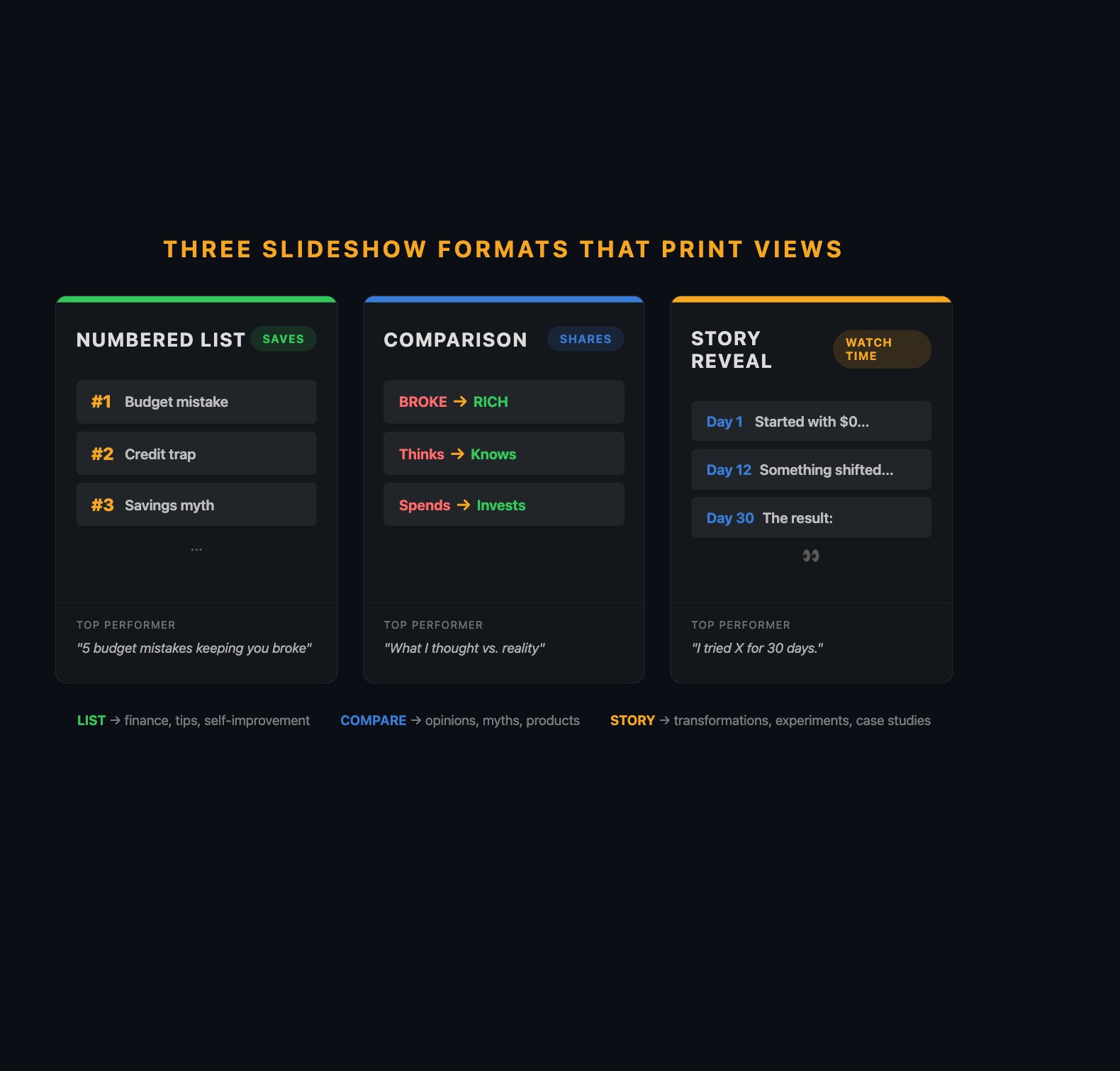
What are the 3 slideshow formats that consistently go viral?
Format 1: The Numbered List
“7 budgeting mistakes keeping you broke.” “5 Stoic habits for a stronger mind.” “10 AI tools you’re not using yet.”
The number in the hook creates a psychological commitment. When someone reads “7 mistakes,” their brain wants all 7. Each swipe is a micro-commitment.
The key: each item needs to be specific and surprising. “Not tracking expenses” is generic. “Paying $47/month for a gym membership you used twice in February” makes people cringe because they have a similar subscription.
Copy-paste template (finance example):
| Slide | Text |
|---|---|
| 1 (Hook) | “5 budget mistakes that keep you broke” |
| 2 | ”#1: Paying for subscriptions you forgot about. The average person wastes $47/month.” |
| 3 | ”#2: Setting a budget but not tracking it. A budget you don’t check is a wishlist.” |
| 4 | ”#3: Treating savings as ‘what’s left over.’ Pay yourself first. Automate it.” |
| 5 | ”#4: No emergency fund. One car repair shouldn’t wreck your finances.” |
| 6 | ”#5: Ignoring the latte factor. $6/day = $2,190/year. Not nothing.” |
| 7 (CTA) | “Which mistake are you guilty of? Be honest in the comments.” |
Production tip: make the last item the most surprising or controversial. The viewer who swiped through all items wants the payoff to be worth it.
Format 2: The Comparison
“What I thought passive income was vs. what it actually is.” “Broke mindset vs. rich mindset.”
Show a pair of slides for each comparison point. Slide A = the “wrong” version, Slide B = the “right” version. The visual contrast creates a rhythm that’s satisfying to swipe.
Copy-paste template (motivation example):
| Slide | Text |
|---|---|
| 1 (Hook) | “Broke mindset vs. rich mindset. Which one are you?“ |
| 2 (Broke) | “Broke: ‘I can’t afford that.‘“ |
| 3 (Rich) | “Rich: ‘How can I afford that?‘“ |
| 4 (Broke) | “Broke: Works for money.” |
| 5 (Rich) | “Rich: Makes money work for them.” |
| 6 (Broke) | “Broke: Buys things to look rich.” |
| 7 (Rich) | “Rich: Buys assets that make them rich.” |
| 8 (CTA) | “Tag someone who needs to hear this.” |
Comparisons generate the most shares because people tag friends to argue.
Format 3: The Story Reveal
“I tracked every dollar for 6 months. Here are the results.” “I followed Marcus Aurelius’ routine for 30 days.”
Unlike lists (where each slide is self-contained), stories create tension from beginning to end. The viewer swipes because they need the ending.
Copy-paste template (self-improvement example):
| Slide | Text |
|---|---|
| 1 (Hook) | “I journaled like Marcus Aurelius for 30 days. Here’s what changed.” |
| 2 | ”Day 1: Felt ridiculous writing about ‘today’s hardest challenge’ at 6 AM.” |
| 3 | ”Day 7: Started noticing I was less reactive in meetings. Coincidence?“ |
| 4 | ”Day 12: A coworker insulted my work. I paused instead of snapping. First time ever.” |
| 5 | ”Day 20: My morning felt incomplete without the journal. It became automatic.” |
| 6 (Payoff) | “Day 30: I haven’t raised my voice in a meeting since day 12. My boss noticed before I did.” |
| 7 | ”2 minutes. Every morning. No app. No course. Just a notebook.” |
| 8 (CTA) | “Would you try this? Follow for the journal template (link in bio).” |
The hook must promise a specific, concrete outcome. “I tried something interesting” is too vague. “I posted one TikTok slideshow every day for 30 days. Month 1: $0. Month 3: $284” is specific enough to make people swipe all 10 slides.
What about those “$4,884 in one day” slideshow screenshots?
They’re real and they’re misleading.
What’s real: A slideshow about a financial product goes viral (500K-1M views in 24 hours). A small percentage clicks the affiliate link and signs up. At $25 per signup with 200 signups, that’s $5,000. It happens. Creators have posted verified affiliate dashboards showing these numbers.
What’s inflated: That’s the outlier day, not the average day. The same creator who earned $4,884 on their best day might earn $30 on a normal day. Nobody screenshots “$3.47 earned today.” Build your expectations around the trajectory ($0, $47, $284, $611, $959, $1,264 over 6 months), not the lottery ticket.
What broke (and the design rules that fix it)
The 43-view slideshow failed because of three specific design mistakes.
Mistake 1: No visual hierarchy. All slides looked identical. Fix: hook slide text is the largest. Content slides are slightly smaller. Body text is smallest but still readable on phone. This tells the viewer’s eye where to look.
Mistake 2: No color consistency. Random stock photos, default fonts. Fix: pick 2-3 colors max. One dominant (background), one accent (highlights), one neutral (secondary text). Dark backgrounds with bright text (gold on black, white on navy) feel premium. Save one Canva template and duplicate it for every slideshow.
Mistake 3: Too much text per slide. Paragraphs on slides. Fix: one idea per slide. Max 15 words. If you need to split a sentence across two slides, do it.
The squint test: Shrink your Canva preview to 50%. Can you still read the text? Keep it. Can’t read it? Too complex. Simplify.
Three more rules:
- Never use more than 2 fonts per slideshow. One headline font, one body font.
- The hook slide gets 80% of the design effort. It’s what appears in the feed before anyone swipes.
- Vary the visual rhythm. Alternate text-heavy slides with image-heavy slides. Don’t make all 10 slides identical.
How should you mix formats across your week?
The strongest strategy rotates all three formats:
| Day | Format | Example Topic |
|---|---|---|
| Monday | Numbered list | ”5 habits for a stronger mind” |
| Tuesday | Story | ”I tried this routine for a week” |
| Wednesday | Comparison | ”How most people handle stress vs. the fix” |
| Thursday | Numbered list | ”3 principles that fix overthinking” |
| Friday | Story | ”He was a slave. He became the most influential philosopher.” |
| Saturday | Comparison | ”Modern therapy vs. ancient philosophy: same ideas” |
| Sunday | Numbered list | ”7 quotes that hit harder in your 30s” |
After a week, compare performance by format. If numbered lists consistently outperform stories, make more lists. Let the data guide your mix.
How do you write hooks that actually stop the scroll?
The hook slide is what appears in the feed before anyone swipes. If it doesn’t stop the scroll, slides 2-10 never get seen.
Bad hook vs. better hook:
-
Bad: “The 50/30/20 Budgeting Rule Explained” (generic, reads like a textbook)
-
Better: “$47/month on a gym you used twice” (specific, makes you cringe)
-
Bad: “Discipline is Important” (stops nobody)
-
Better: “Marcus Aurelius woke at 4 AM during an 8-year war” (specific person, surprising number)
-
Bad: “5 Productivity Tips” (could be any article on the internet)
-
Better: “I deleted 4 apps and got 6 hours back every week” (personal, specific result)
The pattern: specific numbers, personal stakes, or a contrast that creates curiosity. Generic topic labels don’t stop thumbs.
Prompts to generate hooks and slides:
Hook prompt: “Give me 10 scroll-stopping hooks about [TOPIC]. Each under 10 words. Use specific numbers, surprising contrasts, or direct challenges. No generic statements.”
Topic-to-slides prompt: “Turn this topic into a 7-slide TikTok slideshow: [TOPIC]. Slide 1 is a hook under 10 words with a specific number. Slides 2-6 are one idea per slide, max 15 words each. Slide 7 is a CTA question for comments.”
Hook rewrite prompt: “This hook is too generic: [YOUR HOOK]. Rewrite it 5 ways. Make each more specific, more surprising, or more personal. Under 10 words each.”
How does the algorithm distribute your slideshow?
TikTok tests your content in phases. First, 200-500 users see it (0-2 hours). If the slide-through rate and save rate beat average, it expands to thousands, then tens of thousands. This process takes 12-72 hours. Don’t evaluate a slideshow until 48 hours have passed. Slideshows sometimes get a second wind weeks later when the platform resurfaces them for new audiences.
What slideshow format goes most viral on TikTok?
Numbered lists generate the most saves. Comparisons generate the most shares. Story reveals generate the highest completion rates. In practice, lists tend to produce the most consistent performance for beginners because the number in the hook creates a built-in curiosity loop, and the production is the simplest. Start there. Add comparisons and stories as you get comfortable.
What should you actually do?
- If you’ve never made a TikTok slideshow, start with a numbered list. Open Canva, set dimensions to 1080x1920, and build 7 slides using the template above. Post it today.
- If your slideshows aren’t getting views, check the hook slide. Is the text under 10 words? Is there a number or surprising claim? Can you read it at arm’s length?
- If you’re getting views but not followers, add a teaser slide at the end: “Tomorrow: [next topic].” This gives viewers a reason to follow.
bottom_line
- Slideshows outperform video because every swipe is an engagement signal. More signals per view means more distribution.
- Three formats work consistently: numbered lists (saves), comparisons (shares), story reveals (completion rate). Rotate all three.
- The hook slide does 80% of the work. If slide 1 doesn’t stop the scroll, slides 2-10 never get seen.
Frequently Asked Questions
Why do TikTok slideshows get more views than regular videos?+
Every swipe between slides counts as an engagement event. A 10-slide carousel generates 9 swipe events. A 30-second video generates zero during passive playback. More engagement signals per view means more algorithmic distribution.
How many slides should a TikTok slideshow have?+
8-12 slides. One idea per slide, max 15 words per slide. Hook slide under 10 words in big font. CTA on the last slide. Set slide duration to 3-4 seconds each for a 30-40 second total.
What is the best TikTok slideshow format for beginners?+
Numbered lists. They're the easiest to produce, generate the most saves, and the number in the hook creates a psychological commitment to swipe through all items. Start with '5 [topic] mistakes' or '7 [topic] tips.'