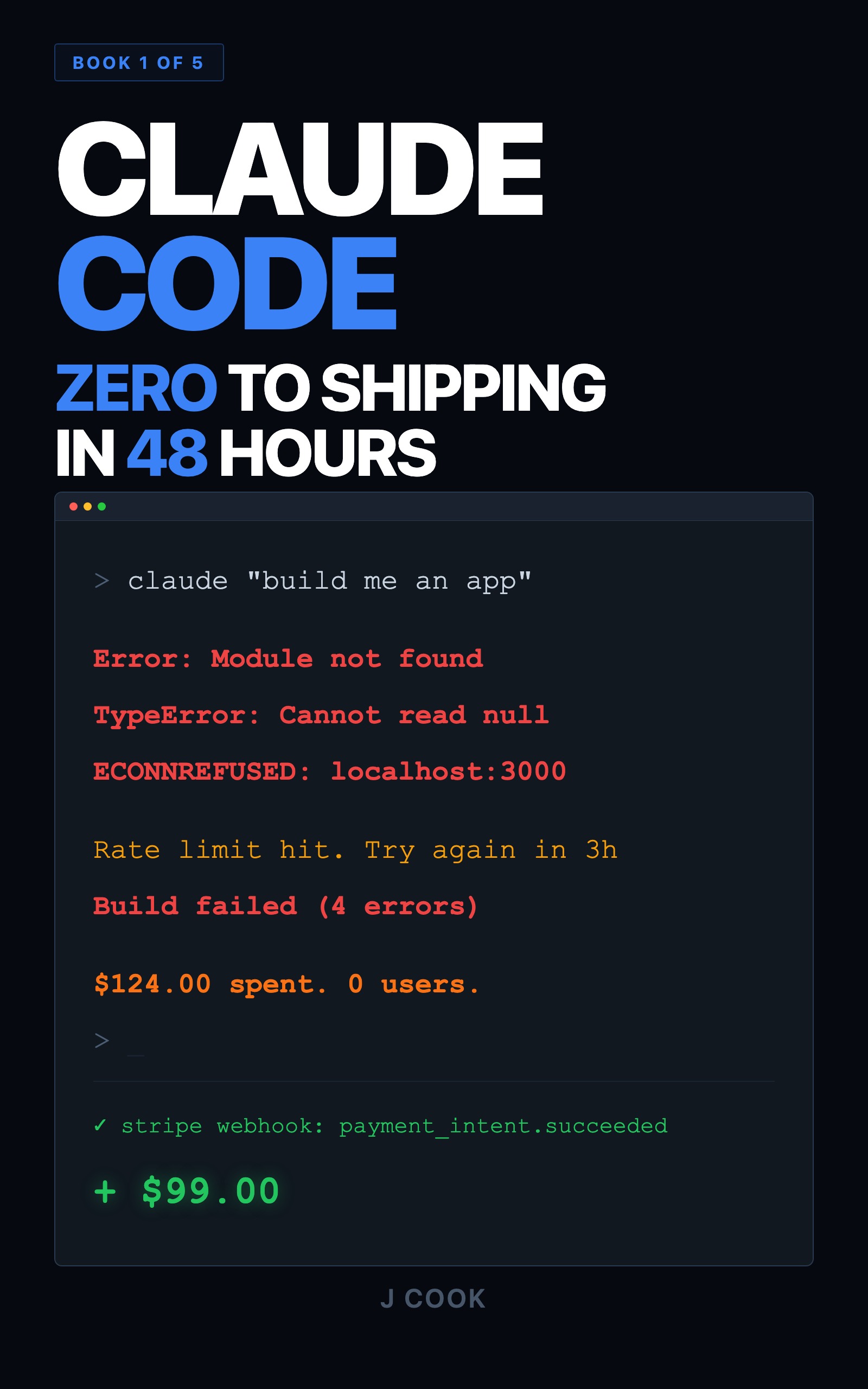
How to Fix Ugly AI-Generated UIs with Claude Code
>This covers the screenshot loop and design system basics. Claude Code for Beginners goes deeper with 9 build steps across 48 hours, from empty folder to launched product with payments.
Summary:
- Claude Code writes correct CSS but can’t evaluate visual output. You need a feedback loop.
- The screenshot verification loop: write code, screenshot, paste to Claude, fix, repeat. Three rounds, eight minutes.
- A design system file prevents the most common visual problems before they happen.
- Copy-paste templates for both the loop workflow and the design system are below.
A post on r/ClaudeAI titled “4 months of Claude Code and honestly the hardest part isn’t coding” hit 942 upvotes and 310+ comments. The top comment: “The hard part is making design decisions. Claude Code will build literally anything you ask for but it can’t tell you if it looks good.”
In the same thread: “I spent 12 hours trying to get an AI chat input bar to look right. The code worked every time. It just looked wrong.”
And the one that still makes me laugh: “Claude will gaslight you about visual stuff all day. ‘The buttons are identical’ meanwhile they’re clearly 10px off.”
These people aren’t bad at prompting. They hit the core limitation of text-based AI: Claude doesn’t have eyes.
Why does “just describe it better” fail?
Because visual design is spatial, not textual. You write “make the header bigger, add more padding, use a darker blue.” Claude fixes those three things. The layout shifts. You describe the new problem. Claude fixes it and breaks something else. Three hours later you’ve sent forty prompts and the page looks marginally better.
The Claude Code docs say it clearly: “Vague requests like ‘improve this codebase’ trigger broad scanning. Specific requests like ‘add input validation to the login function in auth.ts’ let Claude work efficiently.” The same principle applies to UI work. Vague visual instructions trigger vague visual results. But here’s the catch: you can’t be specific about visual problems until you see them.
That’s the trap. You don’t know what’s wrong until you render the page. And you can’t tell Claude what you see because Claude doesn’t see anything.
The fix is a four-step loop.
What is the screenshot verification loop?
Four steps. Run it on every visual change.
Step 1: Claude writes the code. Give a concrete design instruction.
Redesign the task list. Each task should be a card with rounded corners,
subtle shadow, and a color-coded status badge. Group by status:
in-progress first, then todo, then done.
Step 2: You screenshot the result. Open the page in your browser. On macOS, Cmd+Shift+4 and drag. On Windows, Win+Shift+S. Save the image.
Step 3: Paste the screenshot to Claude. Drop the image directly into your Claude Code session. Most people don’t know Claude Code accepts images. It does. Say:
Here's a screenshot of the task list you just styled.
Tell me what looks wrong and fix it.
Claude can’t see the screenshot like a human. But it can analyze the image and identify patterns: inconsistent spacing, text that’s hard to read against its background, shadow too heavy on one side, no clear visual hierarchy.
Step 4: Claude fixes, you verify. Reload. Screenshot again. If it’s better but not done, paste the new screenshot with specific feedback:
Better, but the spacing between cards is still uneven
and the "done" badge needs a green background, not gray.
Two or three rounds gets you to 80-90% of a production layout. That task dashboard I rebuilt? Three rounds, eight minutes. Went from “intern project” to “someone actually designed this.”
Here’s what a real round looks like. I screenshotted a sidebar + data table layout. Pasted it and typed: “The sidebar is too wide and the content area feels cramped. The table headers have no visual distinction from the data rows. The whole page feels like a spreadsheet.” Claude shrank the sidebar, added a gray header background, expanded the content area. Round 2 screenshot: “Better. Sidebar links need more vertical spacing. Table needs horizontal lines between rows. Page title should be bigger than section headers.” Fixed. Round 3: “Add a blue left border on the active sidebar link.” Done. Eight minutes, three screenshots, a page that looks designed.
One important caveat: Claude improves UI faster with screenshots, but you still own final visual judgment. The loop makes Claude a better executor. You’re still the designer.
The key: you’re not describing abstract visual problems anymore. You’re showing Claude the exact output. “Make it look better” (vague) becomes “I see these specific visual issues in this screenshot” (concrete).
What are the most common visual problems Claude produces?
After running the loop on 30+ projects, the same five problems show up every single time.
| Problem | What It Looks Like | One-Line Fix Prompt |
|---|---|---|
| Too much spacing | Elements float in whitespace, page feels empty | ”Reduce all padding and margins by 30%. Elements should relate to each other.” |
| Same visual weight | All text same size, same color, same weight. Nothing stands out | ”Create a clear visual hierarchy. Title largest, section headers smaller, body smallest.” |
| Buttons don’t look clickable | Just text or a faint border that doesn’t register as interactive | ”Primary buttons: solid background + white text. Secondary: visible border.” |
| Inconsistent border radius | Mix of sharp corners, rounded corners, and pill shapes on the same page | ”rounded-lg on cards, rounded-md on buttons and inputs. Nothing else.” |
| No hover feedback | Hover over a card or button, nothing happens | ”Cards: increase shadow on hover. Buttons: darken background. List items: subtle bg change.” |
Bookmark that table. You’ll reference it during almost every screenshot round.
How do you prevent ugly UIs before the loop?
A design system. Sounds intimidating. It’s a markdown file. Fonts, colors, spacing, component styles. Think of it as a CLAUDE.md for visual design.
Create design-system.md in your project root and paste this:
# Design System

## Colors
- Primary: #2563EB (blue-600)
- Primary hover: #1D4ED8 (blue-700)
- Success: #16A34A (green-600)
- Warning: #D97706 (amber-600)
- Danger: #DC2626 (red-600)
- Background: #F9FAFB (gray-50)
- Card background: #FFFFFF
- Text primary: #111827 (gray-900)
- Text secondary: #6B7280 (gray-500)
- Border: #E5E7EB (gray-200)

## Typography
- Headings: Inter, font-semibold
- Body: Inter, font-normal
- Small text: text-sm, text-secondary color
- Page title: text-2xl
- Card title: text-lg

## Spacing
- Page padding: px-6 py-8
- Card padding: p-4
- Between cards: space-y-3
- Between sections: space-y-6

## Components
- Cards: bg-white rounded-lg shadow-sm border border-gray-200 p-4
- Buttons (primary): bg-primary text-white px-4 py-2 rounded-md
  hover:bg-primary-hover
- Buttons (secondary): bg-white border border-gray-200 text-gray-700
  px-4 py-2 rounded-md
- Status badges: px-2 py-1 rounded-full text-xs font-medium
  - todo: bg-gray-100 text-gray-700
  - in_progress: bg-blue-100 text-blue-700
  - done: bg-green-100 text-green-700
- Input fields: border border-gray-300 rounded-md px-3 py-2 text-sm
Then reference it in your CLAUDE.md:
## Design
Follow design-system.md for all styling decisions. Do not deviate from
the defined colors, spacing, or component styles without explicit
instruction.
Two things happen. First, Claude uses specific values instead of guessing. No random blues. It uses #2563EB. Second, the output is consistent across every page. Every card, every button, every badge matches. That visual cohesion comes from repeating the same values everywhere.
The design system cuts loop rounds in half. You start from constrained choices instead of Claude’s default aesthetic.
What about reference designs?
Sometimes you don’t know what “good” looks like. You just know your app doesn’t look like it.
Find an app with the feel you want. Screenshot it. Paste it in:
Make my task list page look like this. Match the spacing, typography,
and layout. Use my design system colors instead of the ones in the
screenshot.
Claude analyzes the reference and adapts its styling to match. Not pixel-perfect, but it captures spatial relationships and the general feel. You point at something that works and say “like that, but mine.”
One rule: don’t screenshot a complex page and expect one-pass replication. Screenshot a single component. Get it right. Then the next component.
What broke when I skipped the loop?
Week one with Claude Code, I did everything through text descriptions. “Make the sidebar narrower.” “Increase the font size of the header.” “The button color is wrong, use the blue from the navbar.” Each prompt fixed one thing and broke another. Fifteen prompts later I had a page that was technically styled and visually incoherent.
The moment I started pasting screenshots, the same fixes took three rounds instead of fifteen. Claude could analyze visual output instead of working blind from my descriptions.
The twelve-hour chat input bar from that Reddit thread? Twenty minutes with the screenshot loop. That person knew what looked wrong. They just didn’t know they could show Claude the problem instead of describing it.
What about empty states?
There’s one visual problem Claude almost never handles on its own: the empty state.
When a user first opens your app or completes all their tasks, they see a blank page. A form floating above white space. It looks broken.
Tell Claude:
When there are no tasks, show an empty state: a simple icon centered
in the task area with text "No tasks yet. Add one above to get started."
Use text-secondary color. Same treatment for loading: add skeleton
cards with a pulse animation where task cards would appear.
Empty states and loading states are the difference between “it works” and “it’s polished.” People form an opinion in the first second. A blank page says the app is broken. A designed empty state says the app is ready and waiting.
What should you actually do?
The full workflow, start to finish:
- Create
design-system.mdwith the template above (or customize it). Reference it in your CLAUDE.md. - Give Claude a design instruction that references the system. “Restyle the main page using the design system. Use cards for each item.”
- Screenshot round 1. Paste the result. Point out the biggest problems. Check the common problems table.
- Screenshot round 2. Paste the updated result. Fix the remaining issues. Claude usually overcompensates on round 1, so round 2 is about pulling it back.
- Screenshot round 3. Final pass. This is where you catch hover states, empty states, and mobile layout. Paste a phone-width screenshot too if you’re being thorough.
Three rounds. Under ten minutes. Do this on every page you build and you’ll never fight with Claude about visual design again.
For reference designs: screenshot an app you like before writing any prompt. Give Claude both the reference and your design system.
bottom_line
- Claude writes correct CSS. It can’t tell you if the result is ugly. That’s the gap.
- The screenshot verification loop closes the gap: write, screenshot, paste, fix, repeat. Three rounds covers 80-90% of visual issues.
- A
design-system.mdfile constrains Claude’s choices. Consistent values produce consistent UIs. Paste the template above and reference it in CLAUDE.md. - Reference designs handle the “I don’t know what good looks like” problem. Screenshot something you like, tell Claude to match it.
- Empty states and loading states are the details that separate “works” from “polished.” Claude never adds them unprompted. You have to ask.
Frequently Asked Questions
Why does Claude Code make ugly UIs even when the code is correct?+
Claude processes text, not pixels. It can write valid CSS but cannot evaluate the visual output. The code compiles and runs, but nobody is checking whether it looks good.
Can Claude Code see screenshots?+
Yes. You paste an image directly into the CLI session. Claude analyzes the visual layout and identifies spacing, alignment, and hierarchy problems it could never catch from code alone.
How many screenshot rounds does it take to fix a page?+
Two to three rounds, about eight minutes total. Each round catches the problems the previous fix introduced. After three rounds you're at 80-90% of a production-quality layout.
More from this Book
5 Claude Code Mistakes Every Beginner Makes
Five mistakes that waste hours in Claude Code and the fix for each. Includes before/after prompts, a CLAUDE.md template, and the 3-line prompt formula.
from: Claude Code for Beginners
How to Use Claude Code Dispatch and Remote Control
Reference guide to Claude Code's power features: dispatch, remote control, channels, and LSP. Includes the adoption timeline and dispatch planning method.
from: Claude Code for Beginners
How to Cut Your Claude Code Bill in Half
Six token sinks that drain your Claude Code budget and the exact fix for each. Real cost math for every subscription tier plus a copy-paste effort function.
from: Claude Code for Beginners
The Vibe Coding Security Checklist (20 Points)
A 20-point security audit checklist for AI-generated code. Covers auth, input validation, data access, and infrastructure with copy-paste grep commands.
from: Claude Code for Beginners